


It is no secret that the marketing for Terminator Genisys has been painful for a majority of fans (hardcore fans).
In a series that used to be grounded in an understandable sense of reality (fear and claustrophobia); it has all gone out the window in favor of reality dismantling CGI (computer generated imagery) and photoshop. Now, whilst that does enforce the whole comic book action thing- this is far from what real Terminator Fans wanted.
Terminator 3 and Terminator Salvation also had below par posters, and Genisys shows no signs of representing the franchise we love any better. However posters are not the final movie and that (sadly) can be the only hope we have that the movie may be better than advertised.
The international poster was released first, then followed the US poster, the notable difference being an American flag in the top left of the poster which isn’t in the international one. Oh, and we just noticed Emilia has a rounder butt in the US poster.

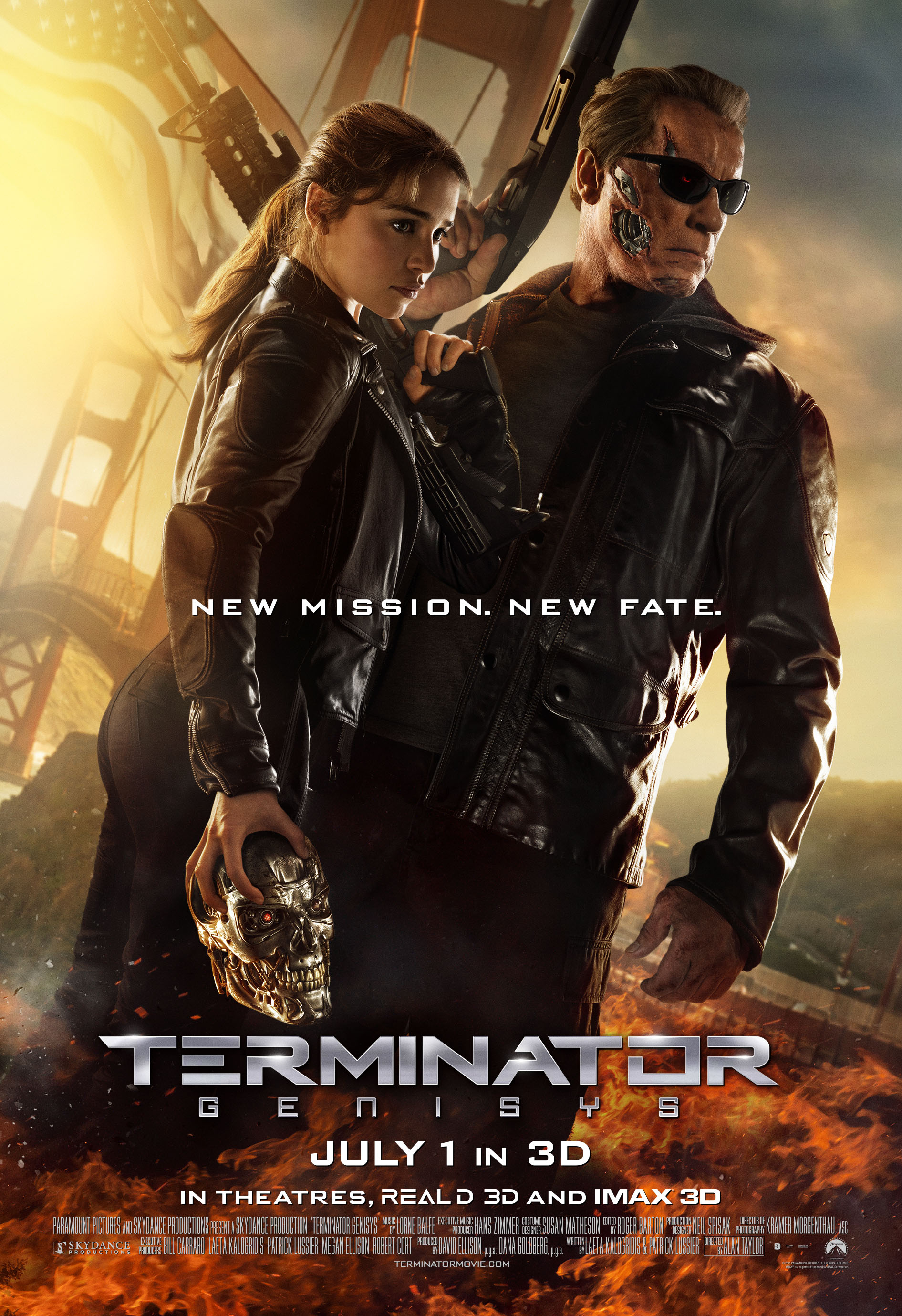
While the poster is an improvement on previous posters,- we yet again have Emilia Clarke’s derriere in our faces, the poster itself makes no sense, again, it is loaded with CGI. The sunglasses are more nostalgic and the first time we have seen Arnold wearing them for this production; we do like the design/style as they do somewhat suit Mr. Schwarzenegger. We just don’t like the marketing for this movie. Sorry if our opinions annoy certain people but that is all they are- opinions: “A judgment or estimation of the merit of a person or thing“.
Our honesty is losing the fans opportunities on TheTerminatorFans.com (sorry guys) and that will fuel us on to be more honest and truthful to the people who matter the most ‘THE TERMINATOR FANS’.
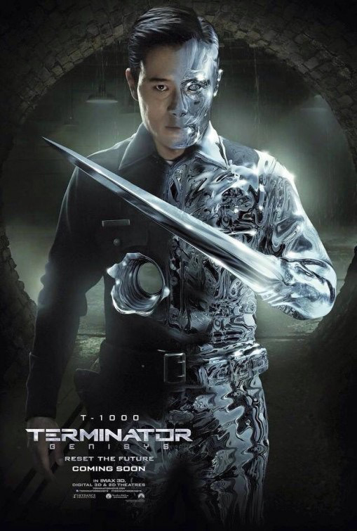
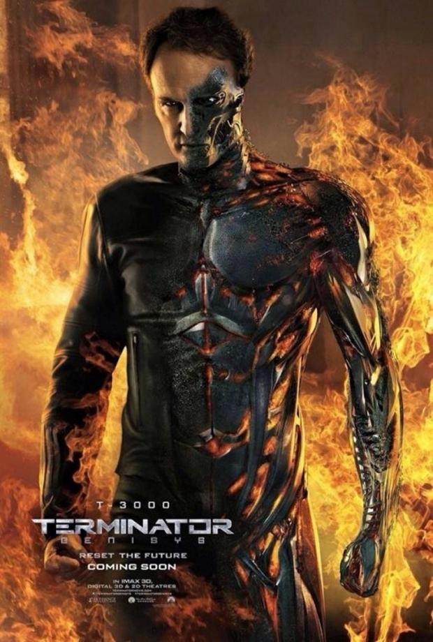
Character Posters:
We held off talking about the character posters. We just don’t like them. Also, images put out are continually at a low-resolution, it enhances the cheap tacky feeling and it also emits the feeling that the studios do not care about this movie other than a summer fluff-buster, quick buck cash-cow designed at making “easy money”.
The photoshop on Emilia Clarke is quite frankly ridiculous and trying to remind fans of the real bad-ass (Linda Hamilton from T2). Emilia does not have her (Linda Hamilton’s, T2) body and just photoshopping a similar build is just insulting; even down to altering Miss. Clarke’s nose to breed the familiarity of Linda’s. If studios wanted the fans to take Emilia seriously as the legendary Sarah Connor then they should have suggested Miss. Clarke adopt a more aggressive workout regime (black tea without sugar simply doesn’t cut it).


Paramount Pictures also do the TMNT movies… notice a similar style but done in better quality of color and resolution? In fact this turtle looks more real than Arnold and co. What’s with all the replicated sunbeams?

Let’s look at the other previous posters…
The focal points are boobs and ass in the ‘Pay-Off Poster’ and the ‘Sarah Connor’ Poster… should the studios really be making such an emphasis on sex and sexy in a PG-13 movie? Arnold is devoid of blood as usual…


Emilia Clarke is always holding the T-800 Skull like a bowling ball… why? Does she take that thing everywhere with her? If the studios idea is to suggest that Sarah Connor is such a bad-ass that she is solely responsible for the decapitation of killing machines then perhaps they lack the imagination to do so in a more unique way- other than to repeatedly replicate the same image and pose. #Stupid
Check out this funny tweet we received from one fan on Twiddah!
@TerminatorFans Come with me if you want to bowl! #SarahConnor #TerminatorGenisys pic.twitter.com/T9vaGemfH1
— Dolomite Jones (@Pitch_Invader) May 11, 2015

Then this original so called ‘poster’ which now feels like a con…

So; which was your favorite poster… did you find the posters as cringe-worthy as we did? Are you disappointed or happy with how the movie has been marketed? Let us know in the comments below.